Contact Information
How to Create Color and Textural Contrast in the Landscape
Ever wonder how professional garden designers put together color combinations and create perfect textural contrast in the landscape? By following a few basic principles, you can do it yourself! Here’s a quick visual study of how it’s done.

The Color Wheel
Artists, interior decorators and garden designers alike all use the same color wheel when choosing colors to pair together and you can, too. Here are a few key takeaways from this diagram:
Warm colors include shades of red, pink, magenta, orange, gold and yellow.
Cool colors include shades of chartreuse, blue, purple and violet.
Neutral colors in the garden include white, silver, tan, dark purple, dark green and near-black.
Harmonious colors are in close proximity to one another on the color wheel. For example, red and orange are harmonious colors.
Contrasting colors are positioned opposite or near opposite one another on the color wheel. For example, blue and orange are contrasting colors.
Now, let’s look how these color concepts play out in real life when we are choosing planting partners for our containers and the landscape.

Boost of Energy Recipe - A Harmonious Color Palette
Ingredients:
Supertunia® Royal Magenta® Petunia
Supertunia® Trailing Rose Veined Petunia
Magenta and purple lie right next to one another on the color wheel which makes them harmonious, also known as related, colors. When you use a mix of such colors, the effect is visually unifying—all of the flowers look like they go together. From a distance, Boost of Energy combination would look purple.
You could get this look using any harmonious colors on the color wheel, for example yellow + orange, blue + purple or green + blue.

Summerfest Recipe - A Contrasting Color Palette
Ingredients:
Supertunia® Royal Velvet® Petunia
Superbells® Coralina Calibrachoa
Notice how different the purple flowers look in this combination when paired with contrasting, rather than harmonious, colors. The dark purple petunias recede while the contrasting bright yellow bidens flowers jump energetically out from the background. Coral is close to yellow on the color wheel, which helps this duo create a nicely contrasting backdrop for the purple petunias. A mix of contrasting colors causes us to pause and take a closer look rather than visually taking in the whole thing at once like we do with a harmonious color combination.

In Our Element Recipe - Using a Color Echo
Ingredients:
Supertunia Vista® Fuchsia Petunia
Supertunia® Mini Vista™ Whit Petunia
Superbena Sparkling Rose Verbena
Using a color echo is an easy trick for making a beautifully designed combination every time. A color echo means the color of one flower or plant is repeated in a different flower or plant in the same combination. For example, in the In Our Element recipe shown here, the fuchsia pink and white petunia colors are echoed in the bicolor patterned pink and white verbena flowers.
Color echoes can be done many ways. You could match the color of a daylily flower’s eye with a solid colored phlox of the same shade. Or you could pair the dark purple star-patterned center of Superbells® Morning Star™ calibrachoa with a solid dark purple Superbena. The variations are endless and so much fun to play around with!
TEXTURE
Knowing how to pair colors together is important, but it’s not the only design element to master if you’re going to have a well-designed landscape and container combinations. Texture is a critical component too, specifically knowing how to pair plants with contrasting textures.

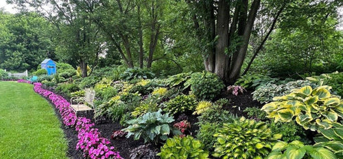
This full shade landscape pairs plants in a neutral color palette of green, chartreuse, silver, white and dark purple. But what really makes this scene dynamic is the mix of contrasting textures between all of the perennials. Silver, broad heart-shaped Brunnera leaves contrast with the narrow yellow bladed grass in front of it and the ferny foliage behind it. Pairing the solid chartreuse colored coral bells with the patterned Brunnera leaves also brings nice contrast even though both plants have somewhat broad, flat leaves.
The spiky texture and upright structure of the astilbe flowers in the background are a nice contrast to the mounded lungwort and coral bells in front of it. Their white color is echoed in the silver Brunnera leaves in front. Though this scene contains a lot of green, no two shades of green are exactly alike, and all of the leaf shapes are different. Both color and texture design elements are used to form an interesting composition.

If you look closely, you will see this perennial combination combines all three principles we’ve discussed—contrasting colors, color echo and contrasting textures. Fall in Love™ ‘Sweetly’ Japanese anemones are adorned with yellow pollen laden centers which are echoed in the yellow sedge at their feet. Magenta pink and chartreuse yellow are contrasting colors on the color wheel. The relatively broad leaves of the Japanese anemone contrast nicely with the narrow bladed strappy sedge.

Brick Road Recipe - A Study of warm, harmonious colors and textural contrast
Ingredients:
ColorBlaze Sedona Sunset™ Coleus
Rockapulco® Orange Double Impatiens
Sweet Caroline Red Hawk™ Sweet Potato Vine
ColorBlaze® Chocolate Drop Coleus
This gorgeous combination looks so well-designed because it uses all of the principles we’ve discussed. Overall, this is a very warm color palette of deep purplish reds and shades of orange. All of these colors are close together on the color wheel, making this a harmonious color palette.
Look at the many different leaf shapes in this container recipe. We have broad, flat leaves near the top, pointy maple-shaped leaves throughout, and the small, scalloped, rounded leaves of the trailing coleus. The impatiens flowers are also rounded, echoing the shape of the trailing coleus leaves. By including such a diverse palette of foliage textures, it gives this entire container an energetic feel and our eyes linger to take it all in.
When you look at your favorite container recipes you are growing this year, study them through the lens of color and texture. Do they include a mix of contrasting or harmonious colors? If your favorites have contrasting colors, make a note to explore more contrasting color combinations for your pots next year. How is the mix of textures looking in your containers? Is there enough of a mix, or could you swap in a different plant with smaller or larger leaves for contrast instead? Make a note of that, too.
Mastering the use of color and texture in design takes some practice, but once you do, your containers and landscape will look like they were designed by a pro—YOU!


